Vintage Kodak 104 Camera by funretro
If you perused the Etsy forums at any given time since joining, you've more than likely seen the topic of photos pop up time and time again. Sellers need critiques, ideas and advice about everything from choosing cameras, appropriate lighting, staging...the list can go on. Many sellers put considerable time and effort in achieving the best photos possible. After all, since a buyer cannot hold your handmade awesomeness in their hand, having a photo that displays your hard work in all of its' glory is imperative to making that sale!
I hopped around Etsy asking different sellers for photo tips and advice they could offer other sellers. Keeping in mind that every creation presents its' own unique set of photography challenges, I sought such advice from a myriad of sellers. Read on for loads of advice they graciously offered:
{Miniature Cranberry Pie by Alliesminis}
Allie from Alliesminis: My tip would be to use natural lighting whenever possible! Also, I always use a macro lens when photographing my minis!
(Yum! Look what a macro lens did for capturing all that detail in her teeny, tiny pie.)

{Catalog Drawer by handandtable}
Hand & Table: My items are vintage, and I find the color gray easy to shoot because shadows don't show and I like the contrast of the natural wood with my aesthetic. Think about the best way to showcase your product to make it stand out and look amazing.
Try several different settings on your camera and see which works the best. You might want to load onto your computer before you decide. They don't always look the same as the screen on the digital camera. Get creative... If you are taking a picture of a reflective object, such as framed art, you are bound to show up in the glass. Make the glass reflect a dark object so it won't show up.
I don't use flash and find natural lighting to be the best. I shoot in my living room with my curtains open. Minor adjustments can always be made on the computer. It is important to have clean photos that are an accurate depiction of the object. It might also be fun to photograph an object with alternate uses the customer might not think of.
A really good idea before photographing you items at home is to look at the websites of really successful stores like shopbop or urbanoutfitters and see what they do. Do or don't do what they do depending on what suits your product.
Make sure your subject is in the shadow, not direct light, I love photographing near a window, for example, because it provides a darker side and a fully illuminated side. The contrast really pops. Make sure your backgrounds are neutral, too.
(Contrast can work wonders. Note how beautiful the color of the yarn is even when there is a sharp contrast between light and dark.)
{Hugs & Kisses Notes by FoglioPress}
Sarah from Foglio Press: On lighting - It's been said many times before I know, but it bears repeating - Natural light is definitely best. More specifically, light coming in from a window, or on a covered porch/patio is ideal, because it is naturally diffused. Shooting in bright direct sunlight will result in harsh shadows and flat images.
Also, to capture more textural detail in the photographs, light the object from an angle rather than front-on. A 45 degree angle often works well. This is helpful if you want to enhance the texture of a beautiful fabric or paper, etc.
If you're using a digital SLR camera, try using a lens with a wide aperture if it's in your budget. A 2.8 or 1.4 lens is excellent for blurring out the background and really focusing in on the star of the shot - your creation! Or, if you have a digital point-and-shoot camera, most have a setting for detail shots - often it's represented by a flower symbol . This should also help a bit in blurring the background.
For close-up detail shots without the investment of an expensive macro lens, you can purchase simple close-up filters that attach to the front of SLR lenses. A few detail shots in your listings can really give buyers added confidence in their purchases. Be sure to carefully choose the details you're showcasing and where you focus the camera. A beautiful, unique charm or masterfully stitched embroidery detail are great to show off; a plain zipper or ordinary hem might not do much to add to the listing.
Think about the whole scene when you're photographing your items, and make sure that the frame isn't cluttered with unneccessary extras or distracting backgrounds. A few well-chosen, relevant staging pieces can help to create a story behind the item, but overall keep it simple so as not to draw focus away from the item you're selling.
When photographing reflective surfaces, photograph them from an angle, and use a polarizing filter if possible. Also, light them from an angle as well so the light will not reflect directly back into the lens.
{Vintage Wood Letterpress Blocks by VintageGalaxy}
Sandy from Vintage Galaxy: I do not use any lighting etc. while taking pictures. I take my pictures during the time when the sun is not at the brightest and not in the open but in an open space which is covered like a varandah. Therefore, my suggestion would be to take pictures in open (not in a room) but covered place, in moderate sunlight (between noon and sunset) and to focus at the center of the object. Also, for each picture you have to post you must take 4 to 5 pictures and select the best one out of that.
{Felted Acorn Pin by Angeldogdesigns}
Tamara from Angel Dog Designs: Like most sellers, I do feel that photos are an important selling point for your work. I prefer shooting my work in natural light, indirect sunlight, even an overcast day can be great. I also try to shoot similarly styled images for similar pieces of work; that way when people are looking quickly at my site, they can find like items by the photographs. I also bring my photos into a photo computer program like Photoshop and adjust the levels, color balance, cropping, etc., to make them look the best they can before I upload them on my site.
 {Vintage Midcentury Pastiche Button Brooch Pin by HopeandJoyStudios}
Julia from Hope and Joy Studios: 1. Natural light is your friend. I take my pix next to a big east facing window. 2. Picasa is MY friend. I take pix with cropping in mind. I leave extra room on the edges so I can crop and center the main item. Also I use their edit tools to sharpen and color correct some of my pix (I never could get that "white balance" issue taken care of). 3. For small items, macro is your friend. I am a camera idiot..I have no clue what all the buttons even DO on my camera, but I know what the macro button is and does. 4. The forums are your friend. There are tons of threads and links in business and site about photography problems and hint and tips to fix. Search the old posts. 5. Do your homework. If you see an interesting shot, figure out why it is interesting to you. 6. Props are your friend. I like to use white background but also old book text, and in my other shop hopeandjoyhome, I use vintage blue and white ticking a lot..it just fits with what I have. If you use actual props, make sure to mention they are not included and don't use so many there is any questions as to what the featured item is.
 {BELIEVE Gold & Green Christmas Banner by BekahJennings}
 Bekah from BekahJennings: When I started selling banners 2 years ago, all the banner sellers were taking straight-on photos. It cut the item apart and there wasn't much of the actual item pictured. I spent a few hours just trying different angles/views until I found one I liked. So don't be afraid to find your own photography style, even if everyone else is doing something else. And don't try to look like other shops. You have your own unique style--find it!
 {Vintage Silver Tinsel String by juliecollings}
 Julie from juliecollings: I sell small vintage supplies and handmade items in my shop so I need my photography to be up close with beautiful details. I shoot all my photographs with natural lighting. My studio has a southern exposure window with great afternoon light. Here are 3 tips for getting a great close-up still shot: 1. clean up your background so you don't get anything distracting in the photo. I have a large piece of foam core I tape background paper to if I need some color or a clean shot. 2. shoot a bunch of photos from several different angles. For a lead photo on my blog tutorials I may take 15-20 shots. sometimes I am surprised which one I like the best. 3. crop your photo to bring details right up front. Get rid of any excess space along the sides. I usually try a couple different cropping options and save them to my desktop so I can compare the photographs side by side to select my favorite.
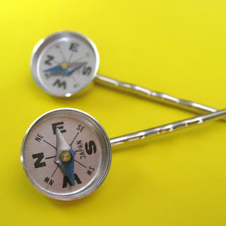
 {Compass Bobby Pins by outoftheblue}
 Jerin from outoftheblue: I'd say that the best advice I can give is to use indirect natural light. I get the best results taking photos by my window in the late afternoon. I also always use the macro setting on my camera and try to get down to the level of the jewelry and get lots of interesting angles.
(Natural light + macro setting + bright solid background = POP!)
 {3D Wall Butterflies - Green Tea Butterfly Silhouettes by hipandclavicle}
Jacqueline from hipandclavicle: I have a 3-part styling tip for completely awesome listings. First, instead of placing your items in front of a white wall or white paper, experiment with backgrounds that are a complimentary color, a contrasting luminosity, or even backgrounds with subtle patterns! You can find some great gently patterned papers at both craft stores and dedicated paper stores, and most fine art supply stores carry lots of beautifully textured fiber-based papers that make for luscious backgrounds. Second, to keep your photos interesting and relevant, make sure you take lots and lots of shots from every angle you can imagine, including close-up and far away shots, then include a range of those in your listing. Finally, include at least one photo of the item in use.
Last, but not least, I'll share a few tricks of my own. My south-facing windows are the biggest source of natural light my home has. In the summer, the trees do a nice job of filtering the light, but I still need to do a little lightening in Photoshop. Rather than directly using a Curves, Levels, or Brightness/Contrast filter under the Image > Adjustments, I'll use their counterparts under the Layer > New Adjustment Layer menu. This gives me the exact same result without directly working on top of the photo itself. If I'm not satisfied with the result, I can always open the adjustment layer and, well, adjust it!
Now back to my lighting scenario. Another challenge I have is that in the winter - when my trees lose their leaves - I have nothing to diffuse all that sunlight! To work around this, I'll simply tape a big sheet of cheap wax paper across the window. Problem solved.
Oh, and one more thing. Doggie nose prints can cast shadows, so make sure you have clean windows before shooting. Trust me, I know. :-)


great post!!! This will come in handy for a lot of people!
ReplyDeletefabulous article, thanks very much. I would like to add that I use a grid/guide feature on my camera so I know where I'm going to crop. I crop all my Etsy photographs to squares therefore I shoot with square in mind.
ReplyDeleteThis is also very specific to my product (vegetable seeds) but wet veggies and herbs look way better than dry.
This is a wonderful post! Great idea and great tips! Thank you for putting this together and thank you to everyone who contributed!
ReplyDeletewhat a really informative post! so full of useful information & you really spent time and researched to get so many interesting points of view. many pointers can be used and adapted in so many different ways...great job :)
ReplyDelete♥ thanks too for including my felted acorn pin ♥
Any tips for taking pictures of people wearing clothing items? I take my pictures outside, but it's getting too cold to do this! brrr....
ReplyDeleteSuch a helpful collection of tips! I'm so proud to be in the presence of so much wonderful talent. :o) Great work!
ReplyDeleteseasonofthevalley, try a window with a white wall o board behind you, the sidelight works wonders!! set with flash off.
ReplyDeletesee my other shop (I'm Yarmee :)
http://larimeloom.etsy.com